01Art Direction
Concept: the opening
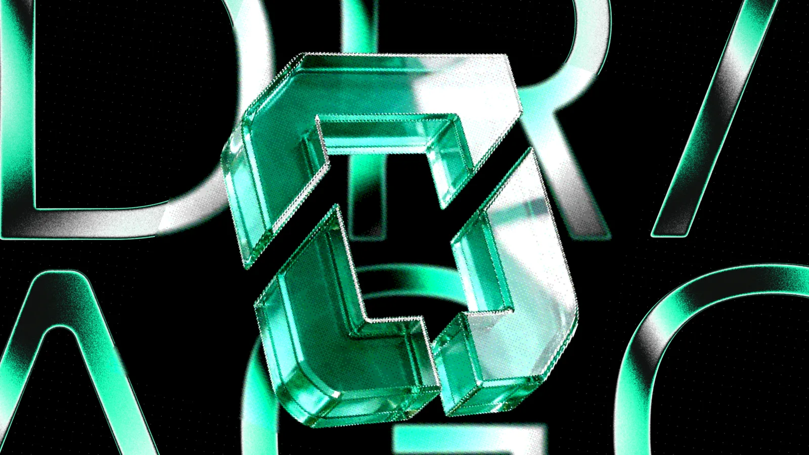
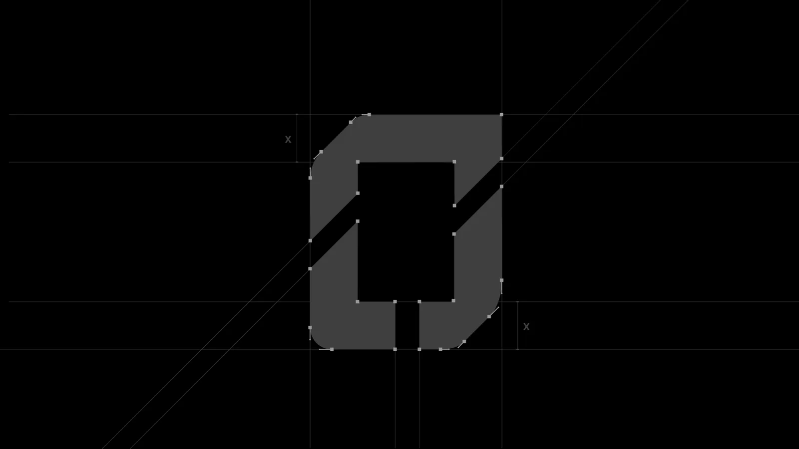
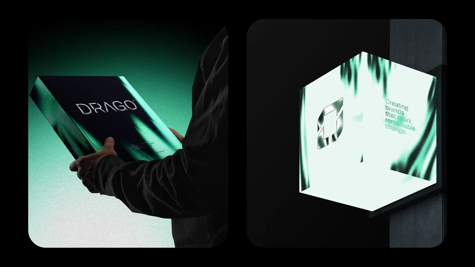
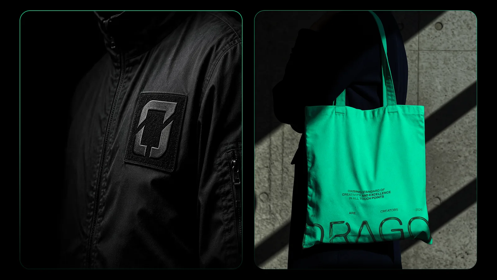
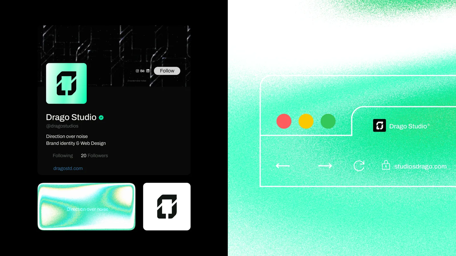
Drago Studio makes one argument: a brand does not end at the logo, it has to survive the screen. The identity had to carry that argument in its own shape. So the system starts from a single idea, an opening where light gets in. The symbol is built on a custom D, cut by a controlled diagonal: an opening in the structure, not a decoration on top of it. It behaves the way the studio works, a rigid, architectural base with one precise place where light and attention enter.
Typography
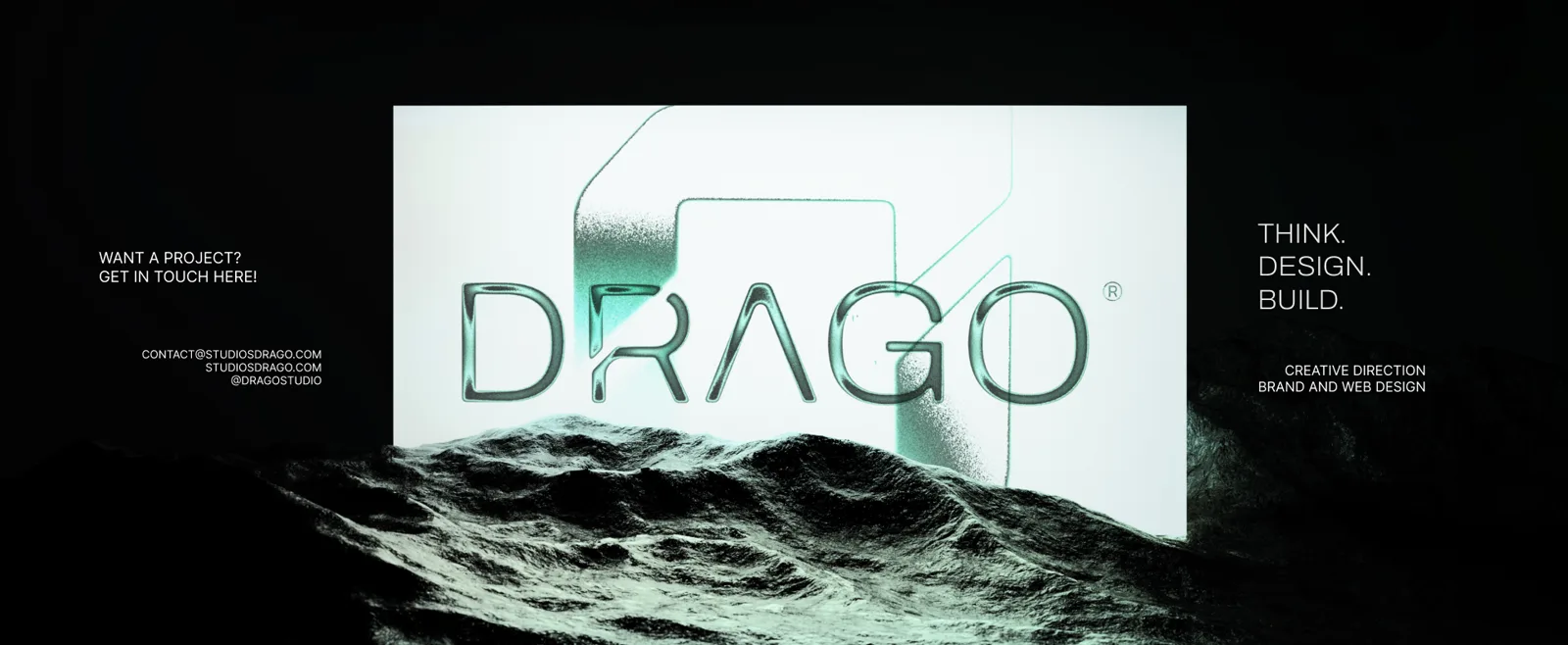
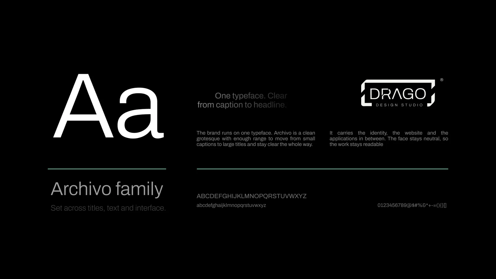
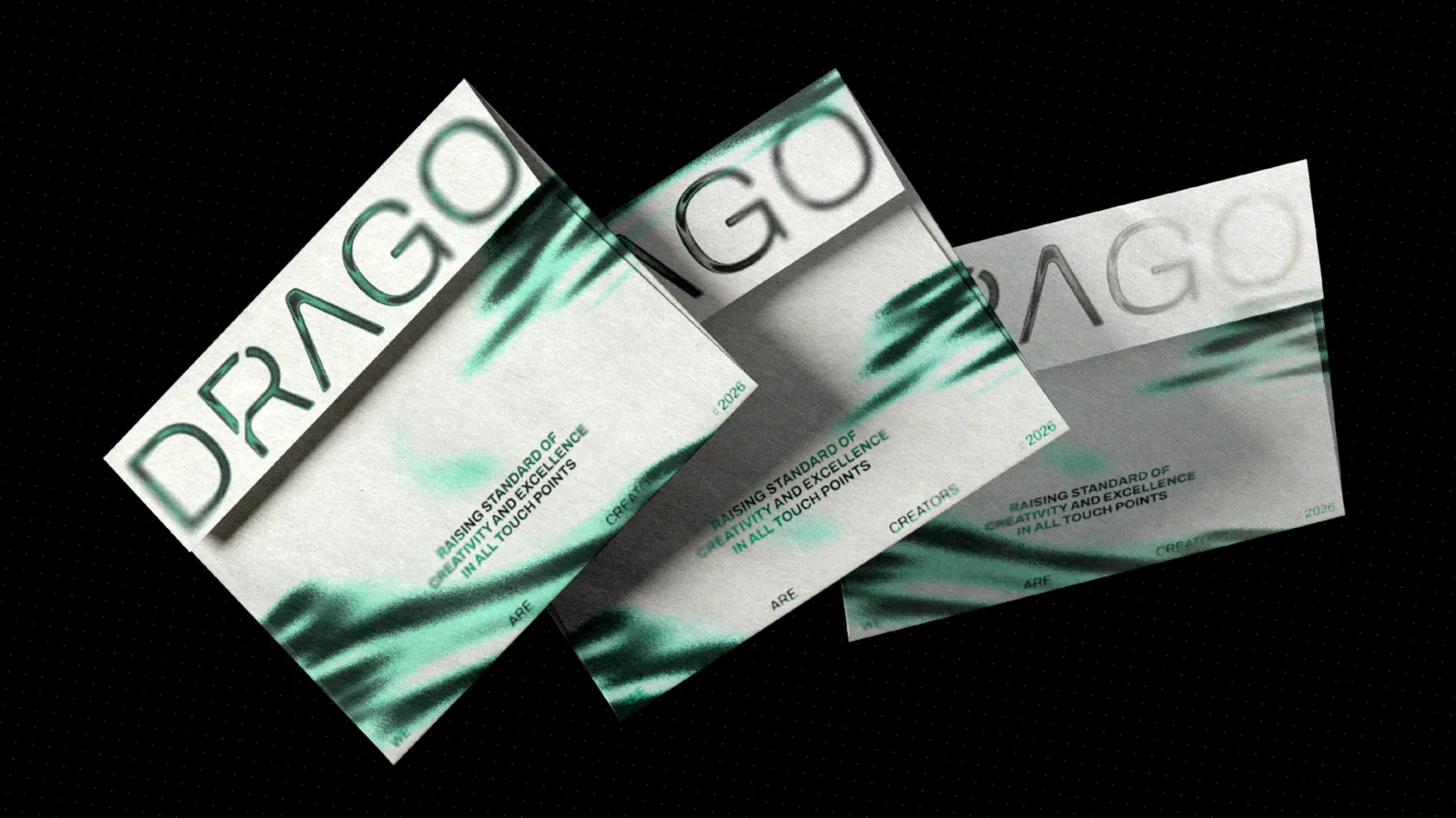
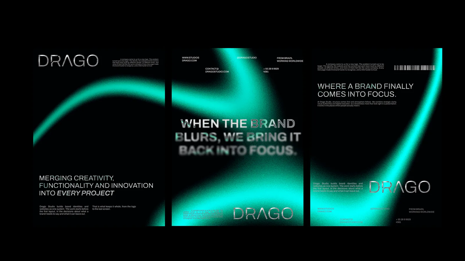
The wordmark is a custom grotesque, editorial and clean, with small authorial cuts on the letters that echo the opening in the symbol. Everything else in the system runs on Archivo, a grotesque chosen for its range and its restraint. It moves from a small caption to a large statement without ever competing with the work.
Colour & application
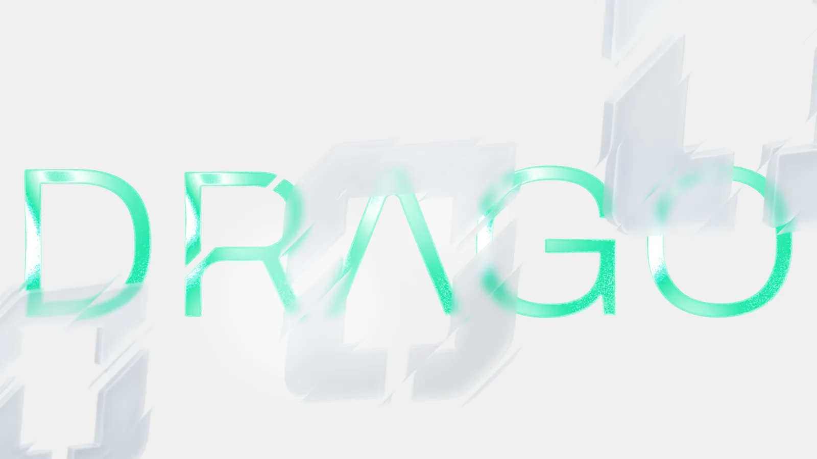
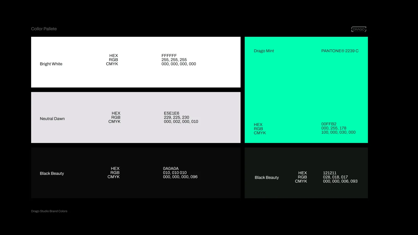
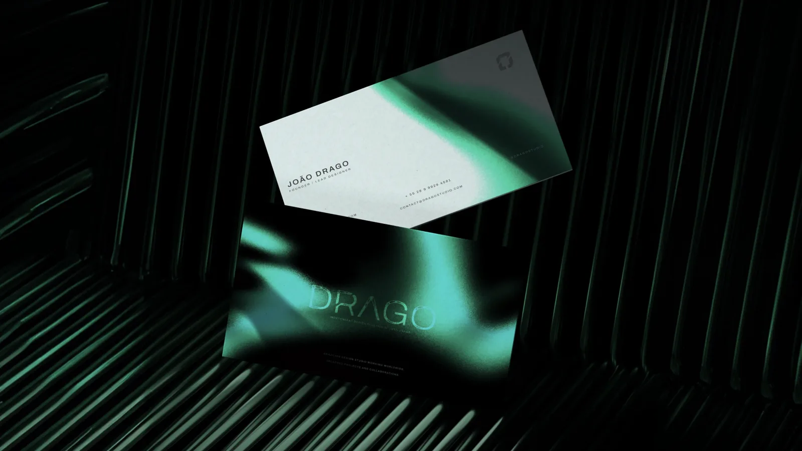
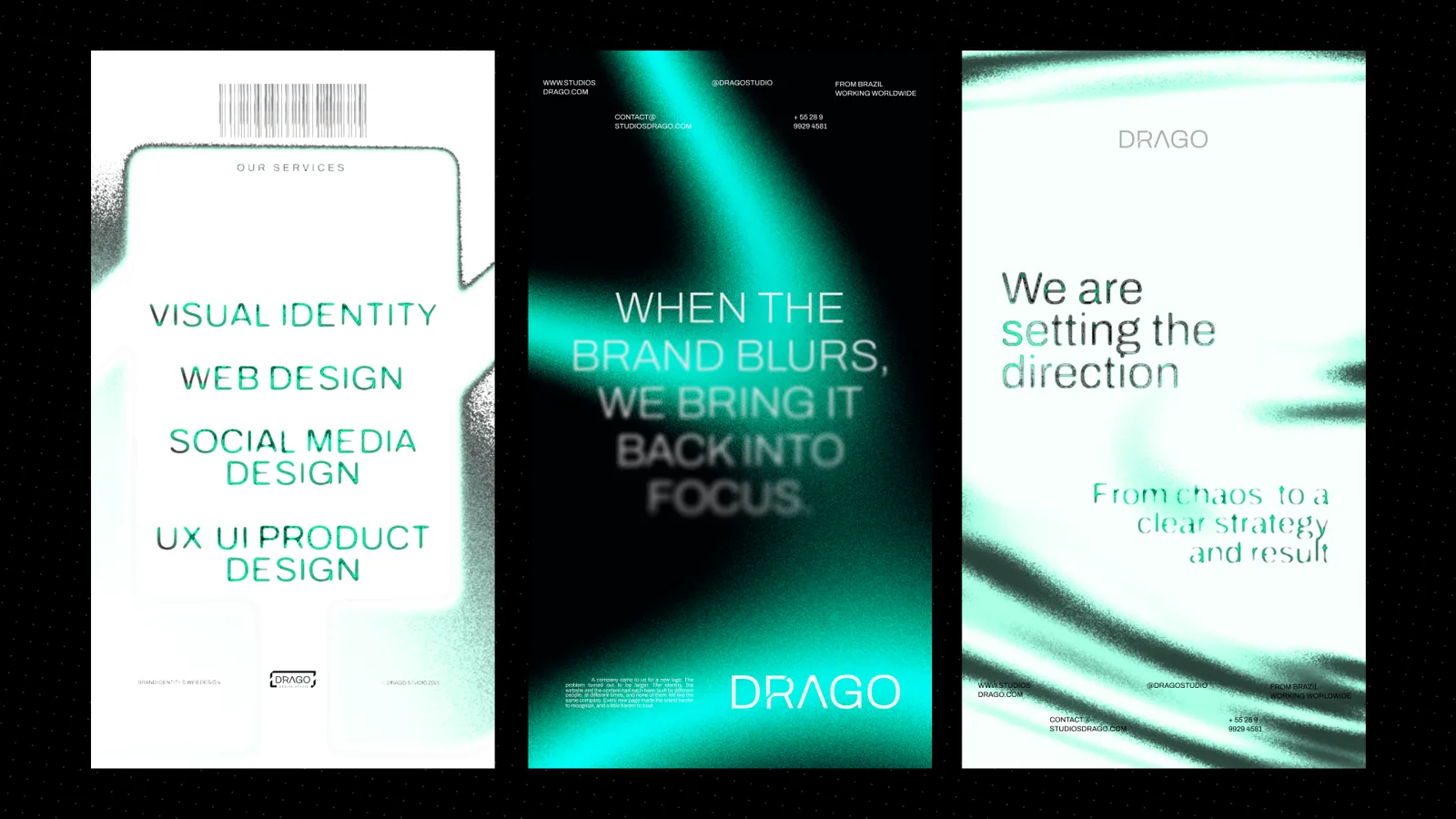
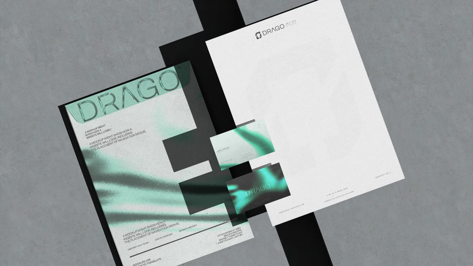
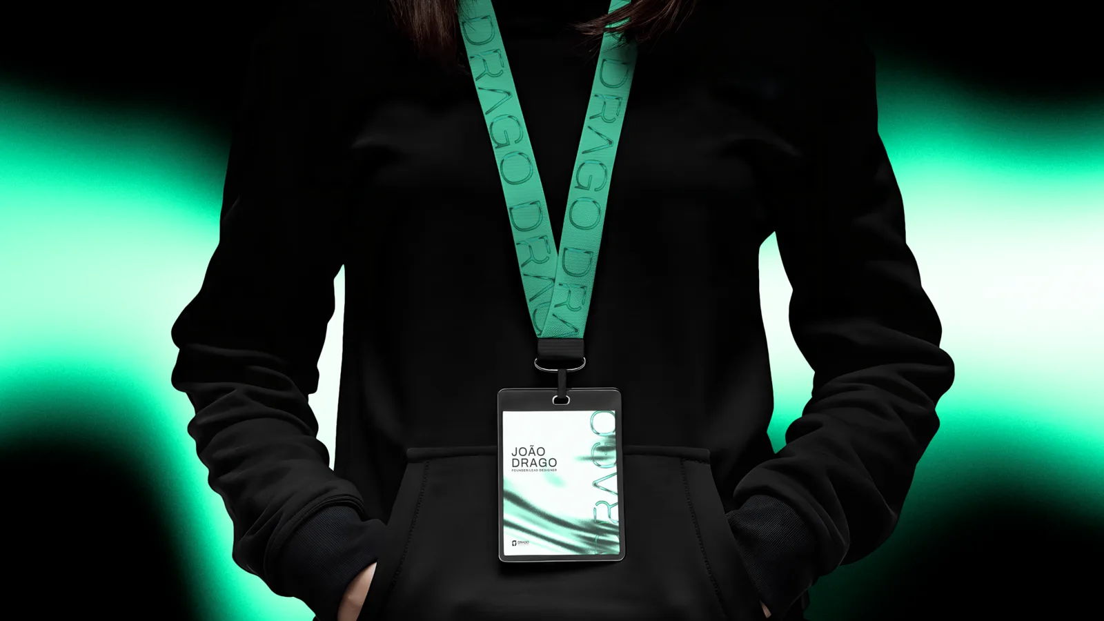
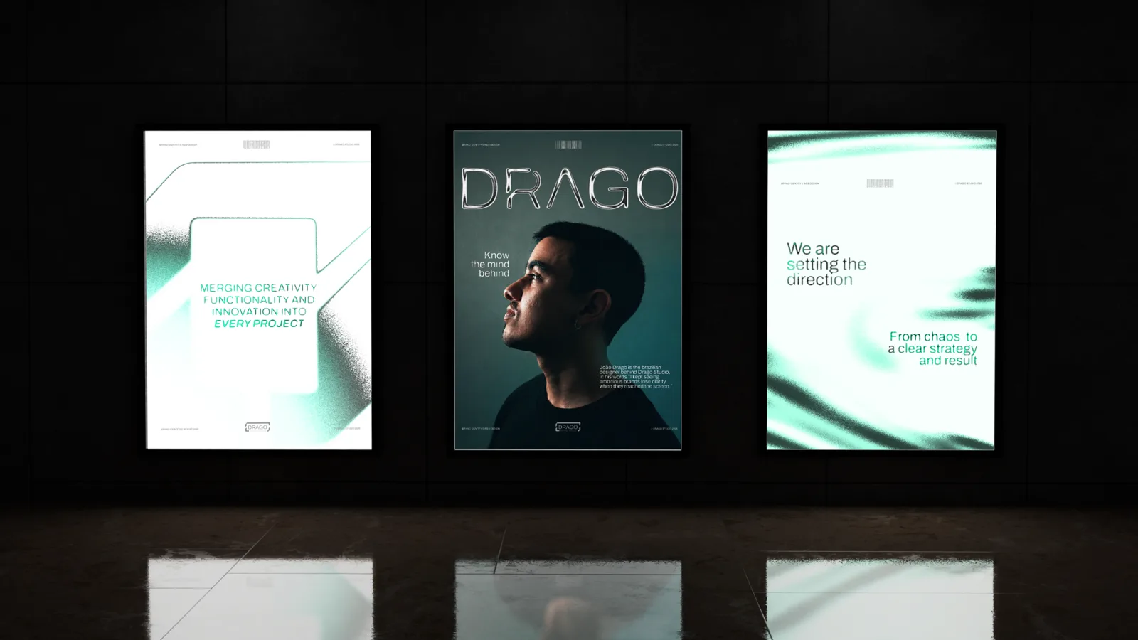
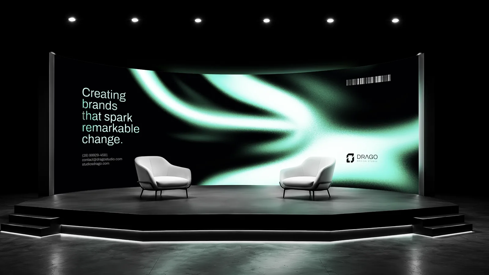
The palette is built on restraint. Near-black and a warm off-white hold the foundation, graphite gives the technical base, and a muted blue-gray brings the diffused light the system lives in. A soft mint is the only accent, used for a line, a detail, the opening itself, never as a background. It keeps the brand premium and quiet at the same time, and never neon. The same system holds from a favicon to a full site in motion.
02Creative Process
Positioning & territory
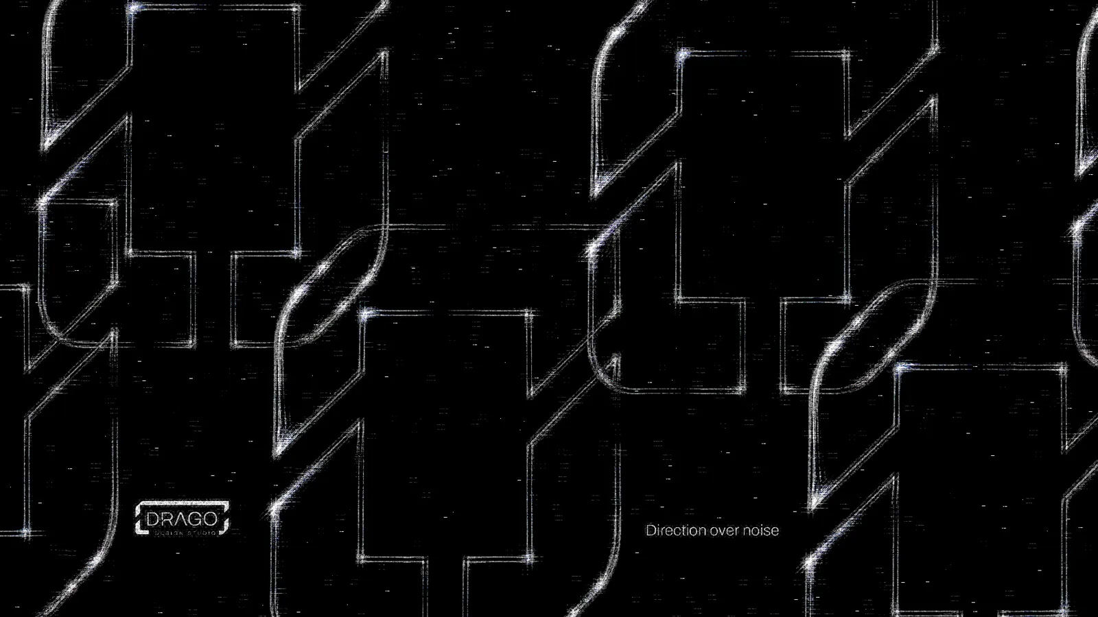
I built the studio the way it builds for clients. It started with positioning, what Drago is, who it is for and what it refuses to be, before any shape existed. From there came the visual territory: editorial grids, diffused light, restrained digital matter and material mockups, drawn from studios I admire without copying any of them. Only with that settled did the symbol, the type and the palette start to take form.
From Figma to the live site
The identity was designed in Figma, and the brand imagery produced and refined with AI as a tool under my direction, with Magnific and Claude Code in the workflow. Then the website was built to actually run, with animation and interaction in code and AI-assisted development, so the brand could be tested in the one place that matters most: a live screen. The studio that argues a brand has to survive the screen had to prove it on its own.
Outcome
The result is a studio that looks like its own argument. One system where the symbol, the type, the language and the website all belong to the same brand. Identity and web, built as one, from the first decision to the live screen.