01Art Direction
Concept
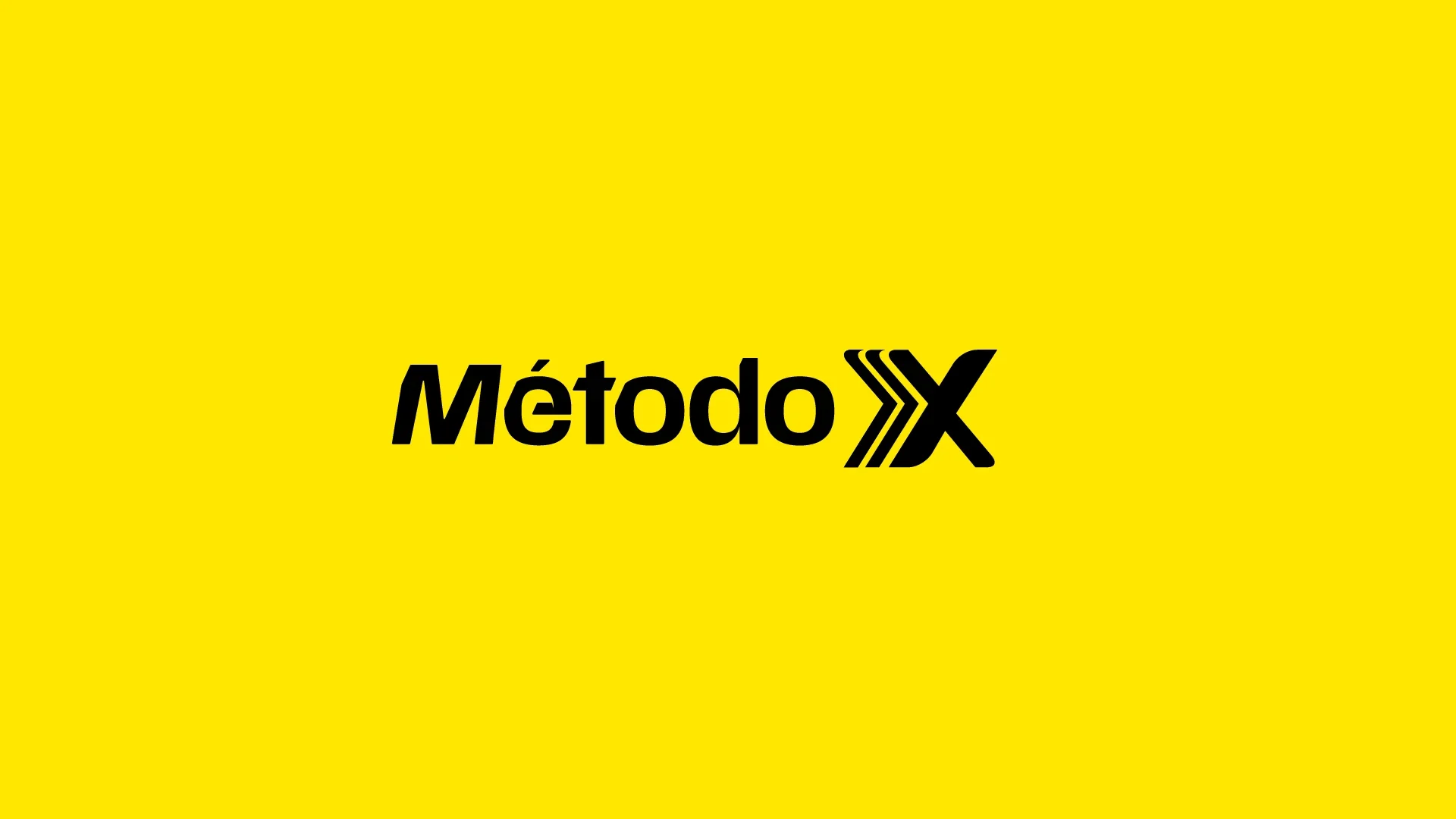
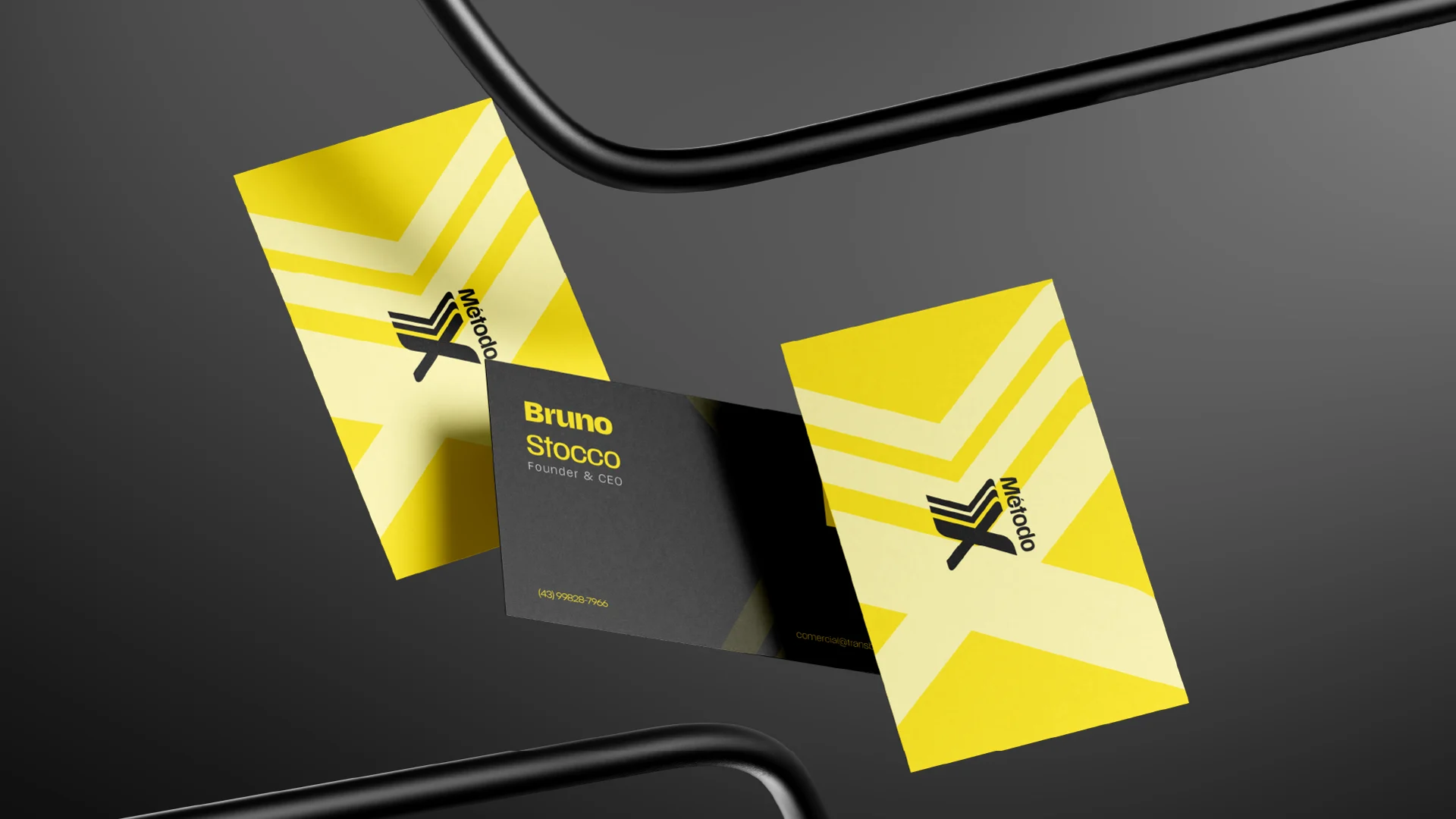
Sales and growth agencies tend to look the same: corporate and safe, or loud and cheap. Método X had to look like the one thing it actually sells, speed. So the name became the system. The strokes of the “X” turn into arrows pointing forward, a mark built on momentum, acceleration, and the exact moment a business breaks away from its competition.
Colour
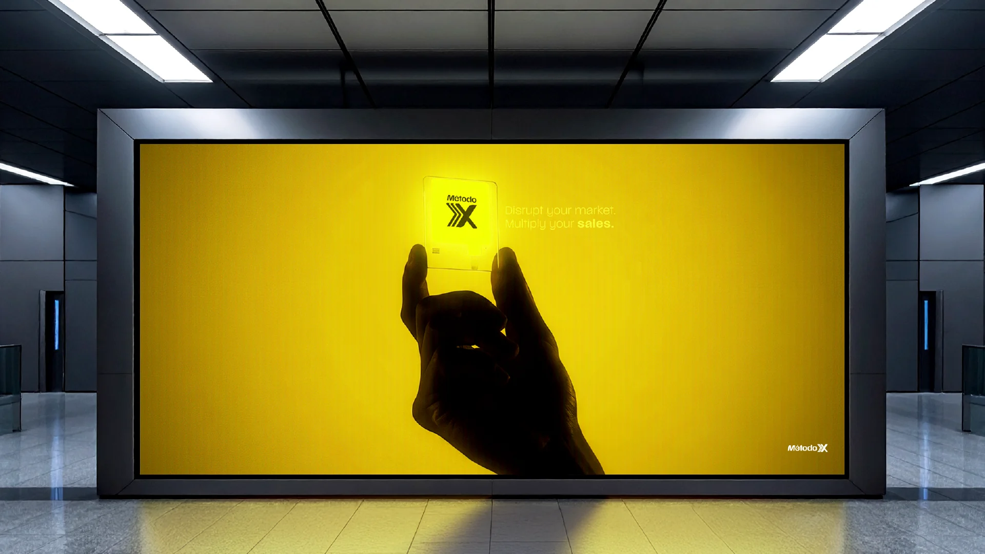
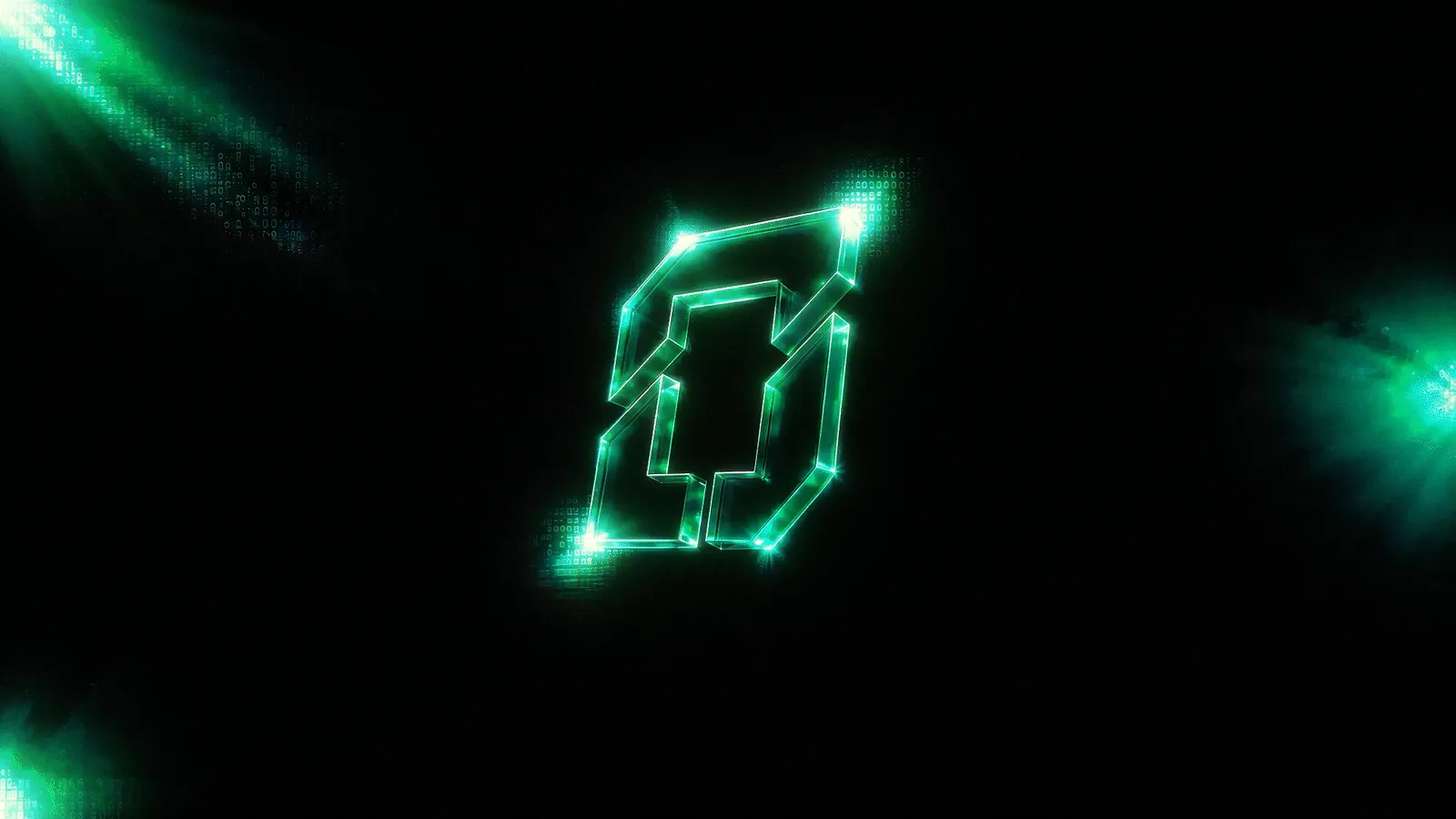
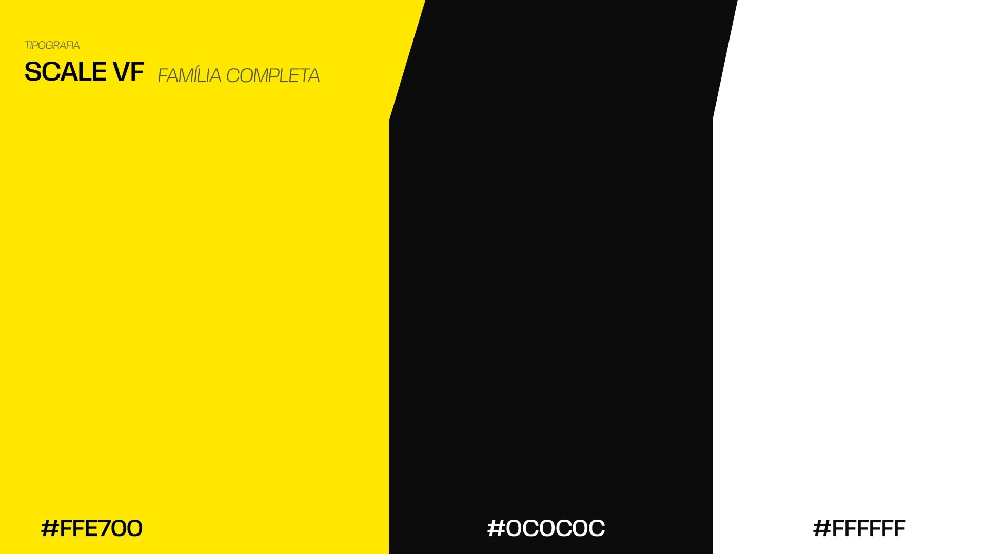
Electric yellow (#FFE700) against near-black was the decision that carried everything. It reads as energy and money at the same time, the kind of colour you can’t scroll past. It works just as well on a subway panel as on a 3D neon render inside a dark hero. Off-white and deep black give the rest of the system its base.
02Creative Process
Signature and application
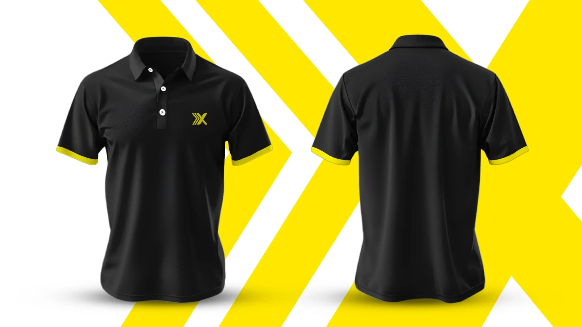
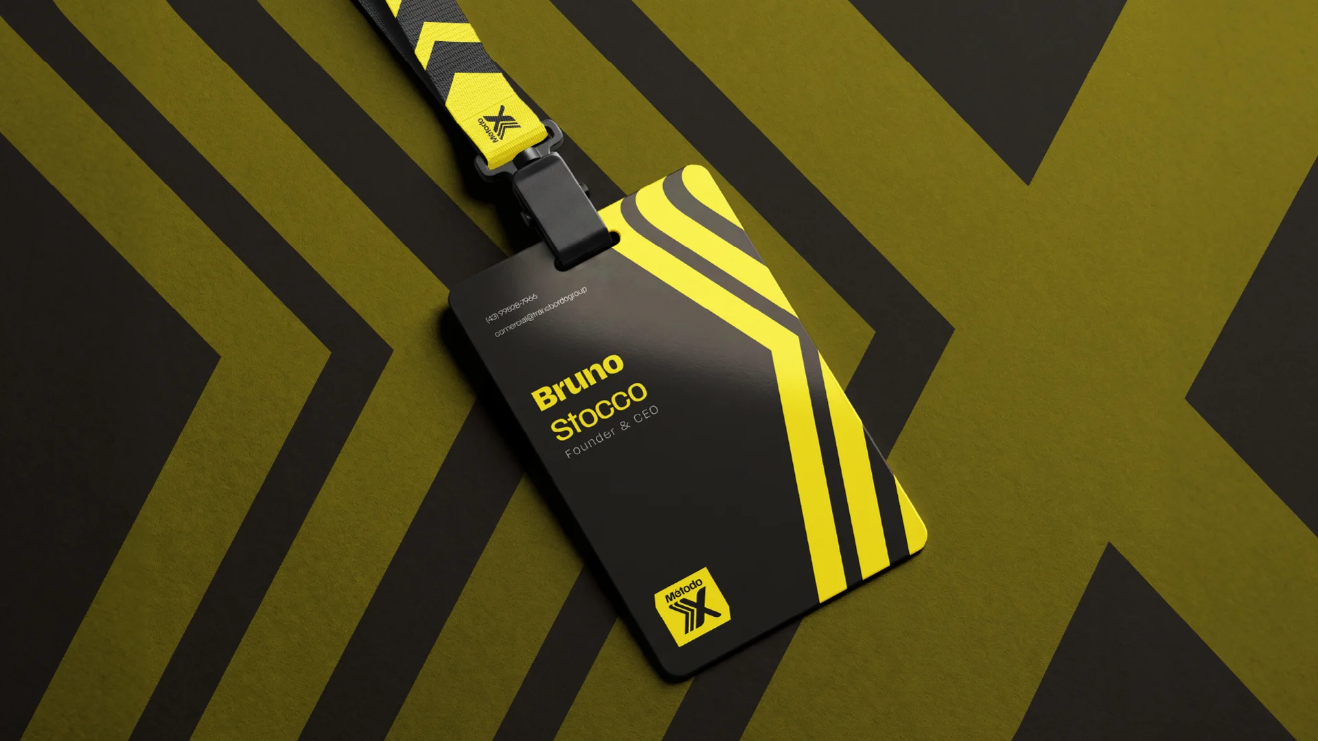
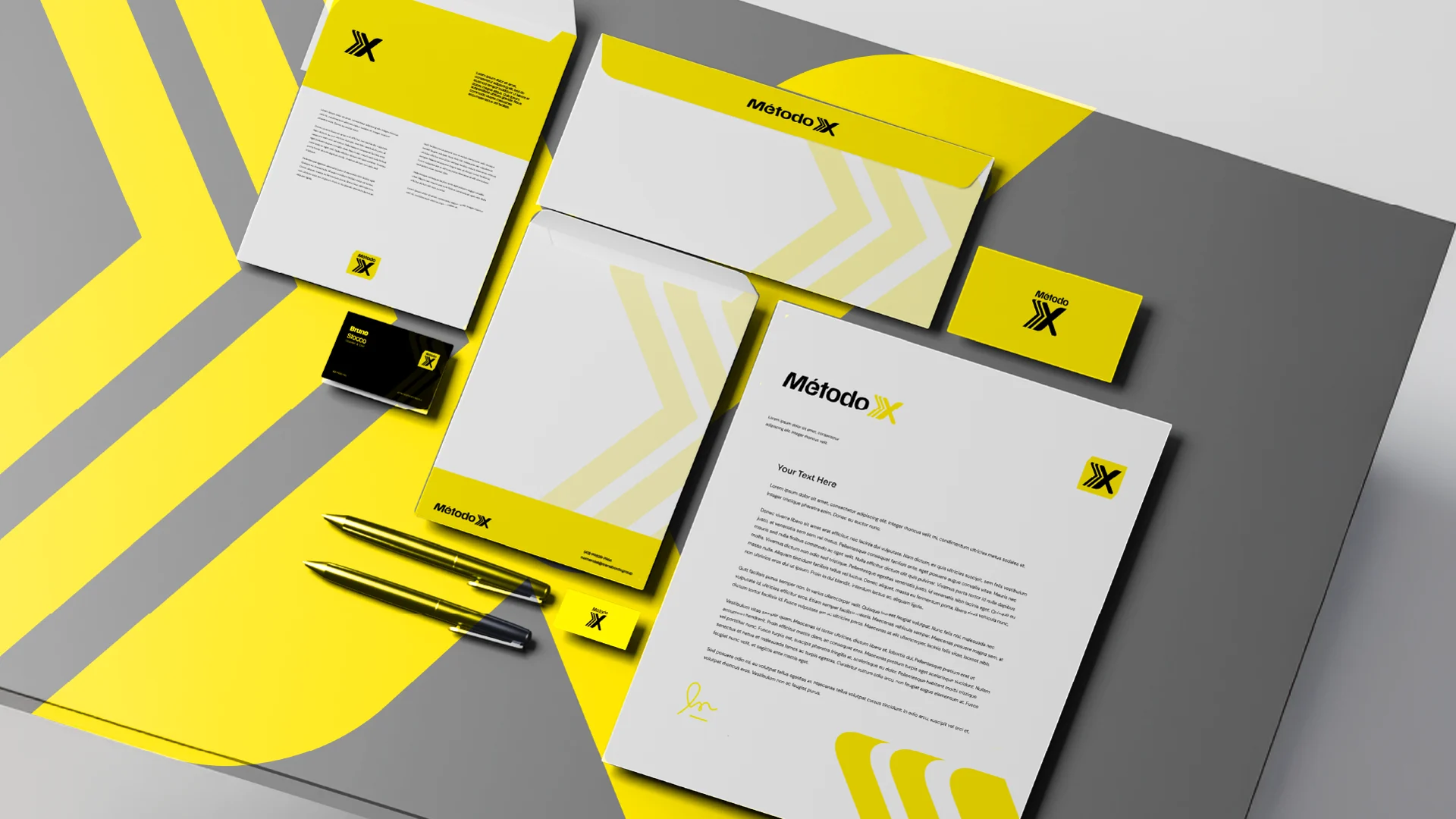
The “X” mark was built to hold up everywhere the brand shows up: a favicon, an app-style icon, embroidery on a polo, the founder’s lanyard, printed stationery, and a two-metre out-of-home panel. Scale VF, a variable typeface, is what gives the wordmark its movement and lets the system stretch from tiny UI labels to oversized statements.
The system and two landing pages
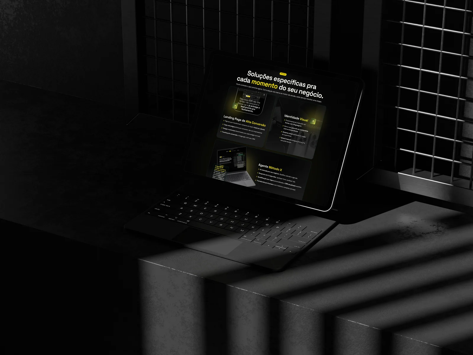
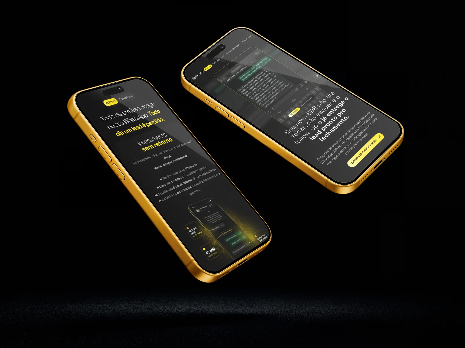
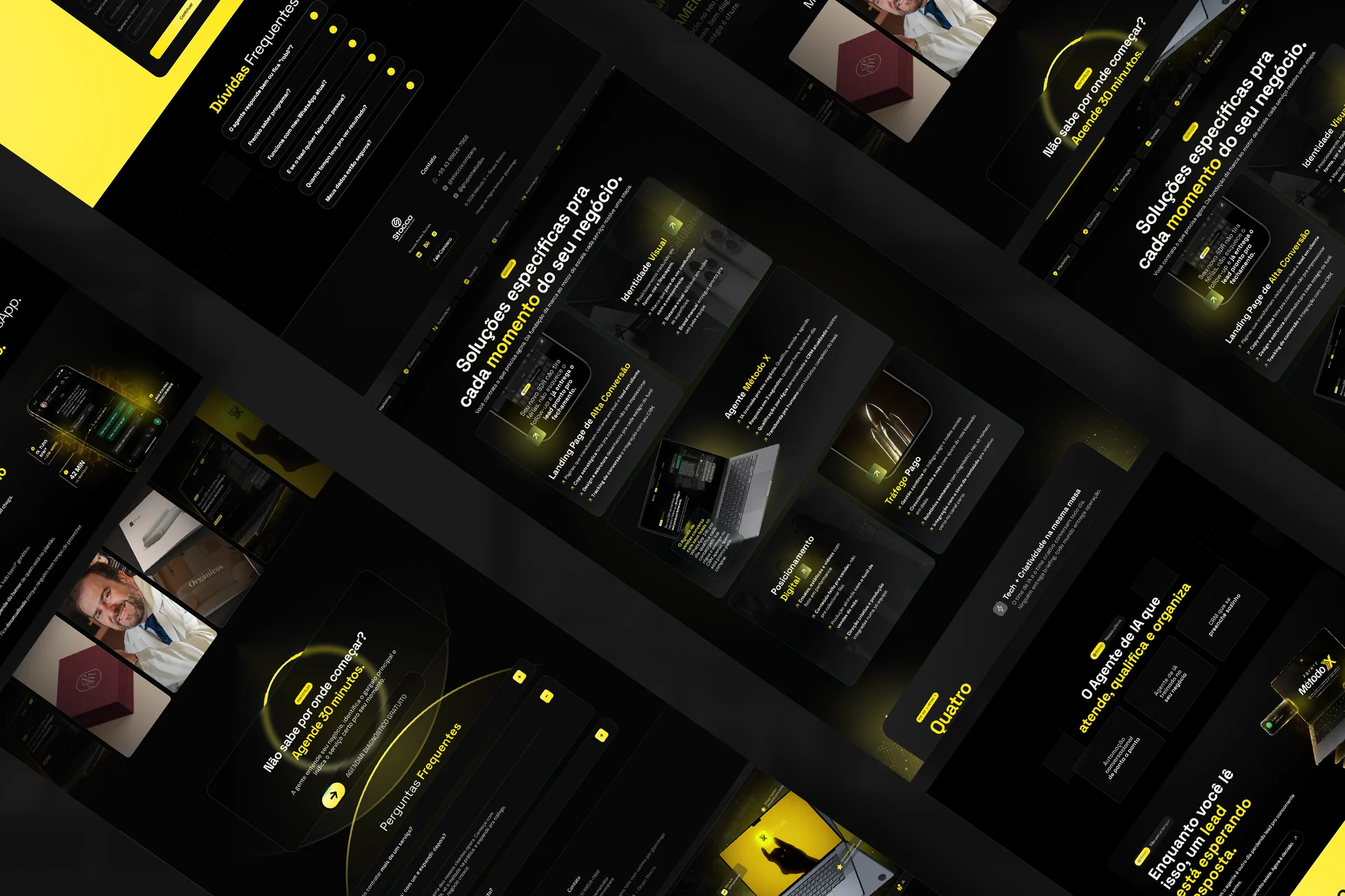
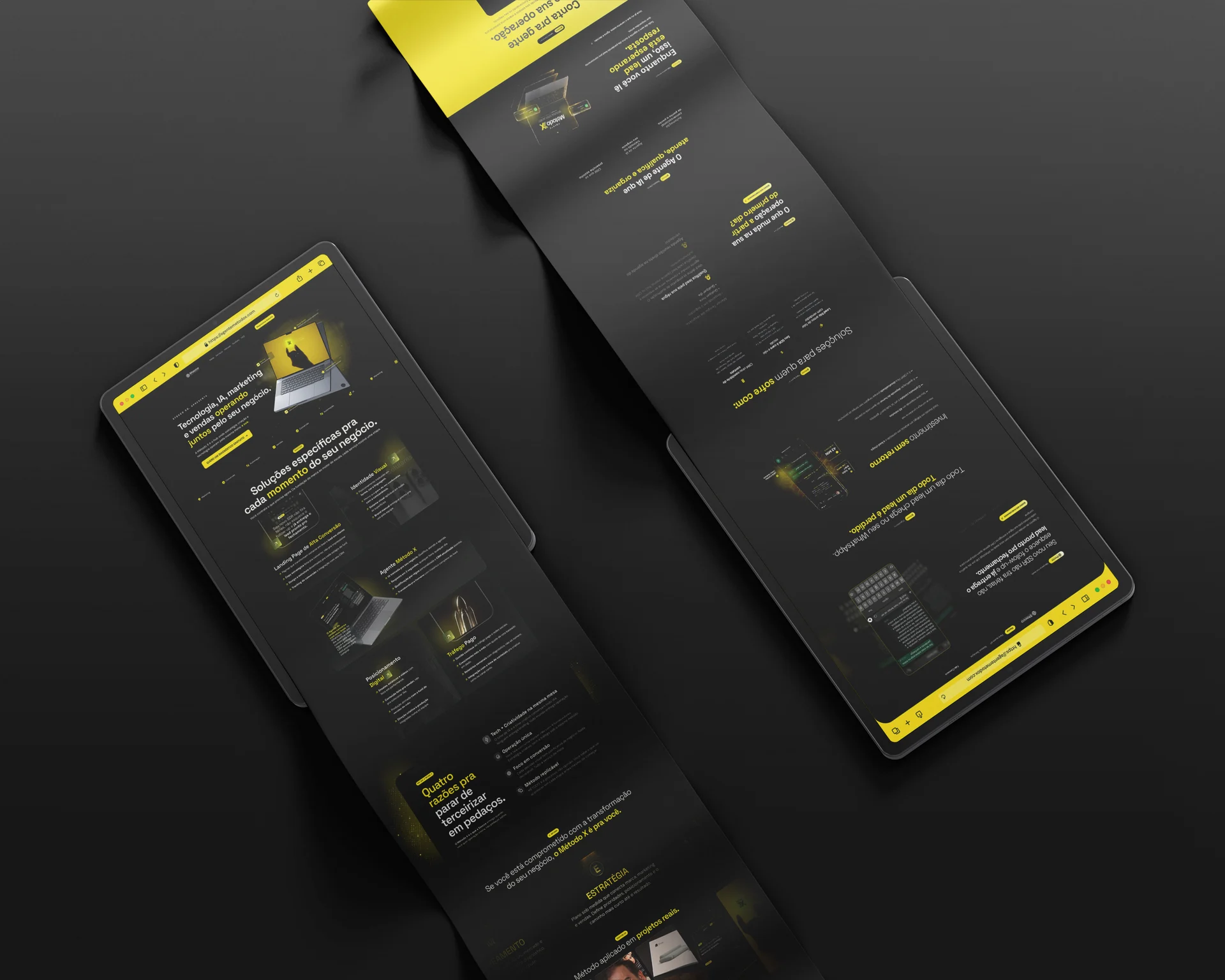
With the direction settled, we built the full system and put it to work across two landing pages. The institutional page positions Método X and its services with a bold, high-contrast layout and GSAP motion. The second one launches the Agente Método X, an AI sales agent: an SDR that answers on WhatsApp, qualifies leads around the clock, and drops everything into a self-filling CRM. For it, we created a dedicated darker sub-system, Space Grotesk for titles, DM Sans for body text, off-white on near-black, with the yellow saved for the moments that have to convert. Both pages were designed in Figma and shipped with AI-assisted development.