01Art Direction
Concept
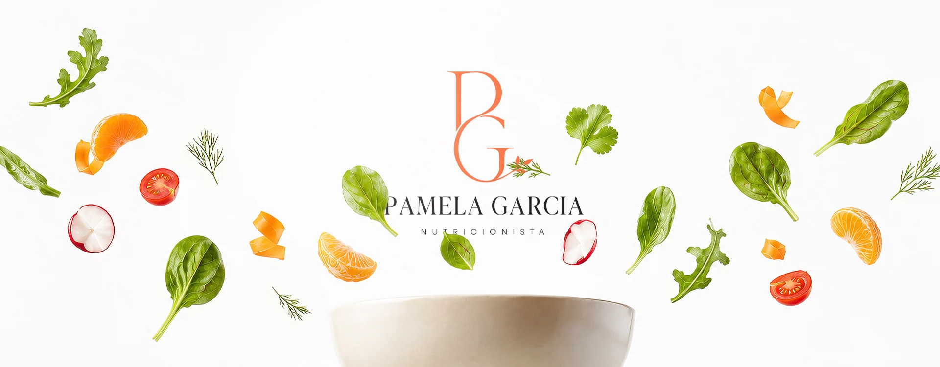
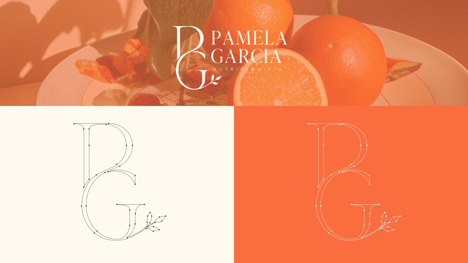
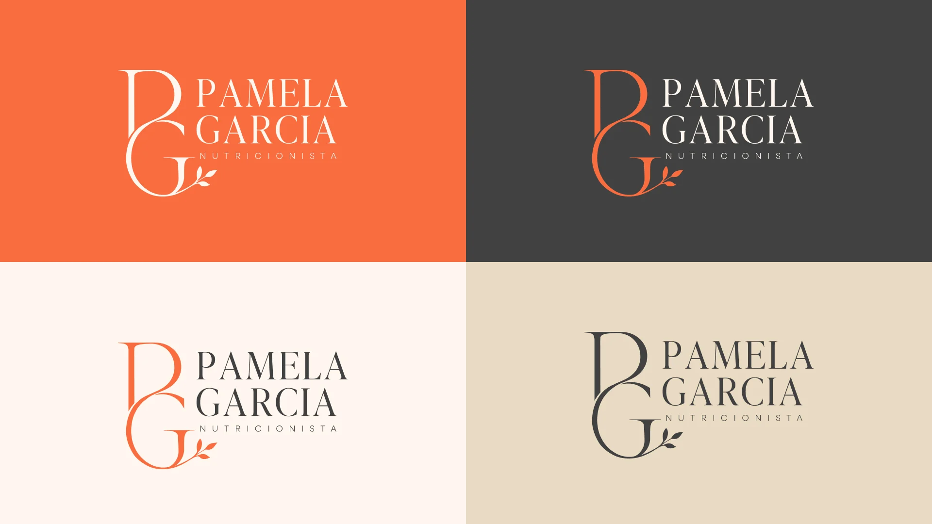
Pamela Garcia's identity is born from the meeting point between what nourishes and the woman being nourished. The leaf represents the natural side: real food, the body's cycles, and care that unfolds without rush. The face represents the human side: the woman at the center of the process, her stage of life, and her relationship with her own body. Between the two, the PG monogram intertwines technique and warmth into a single line. It is a brand that does not see nutrition as a rigid rule or as a battle against the body, but as a lighter and more conscious way of caring for oneself. A lightness that is not superficial: it comes from the nature of food, from respect for each woman's timing, and from an aesthetic that breathes.
Colour & type
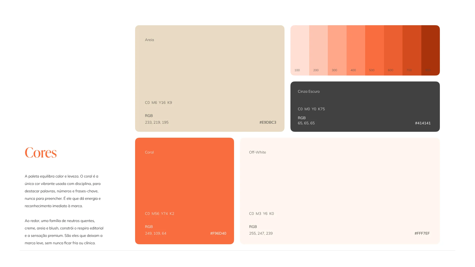
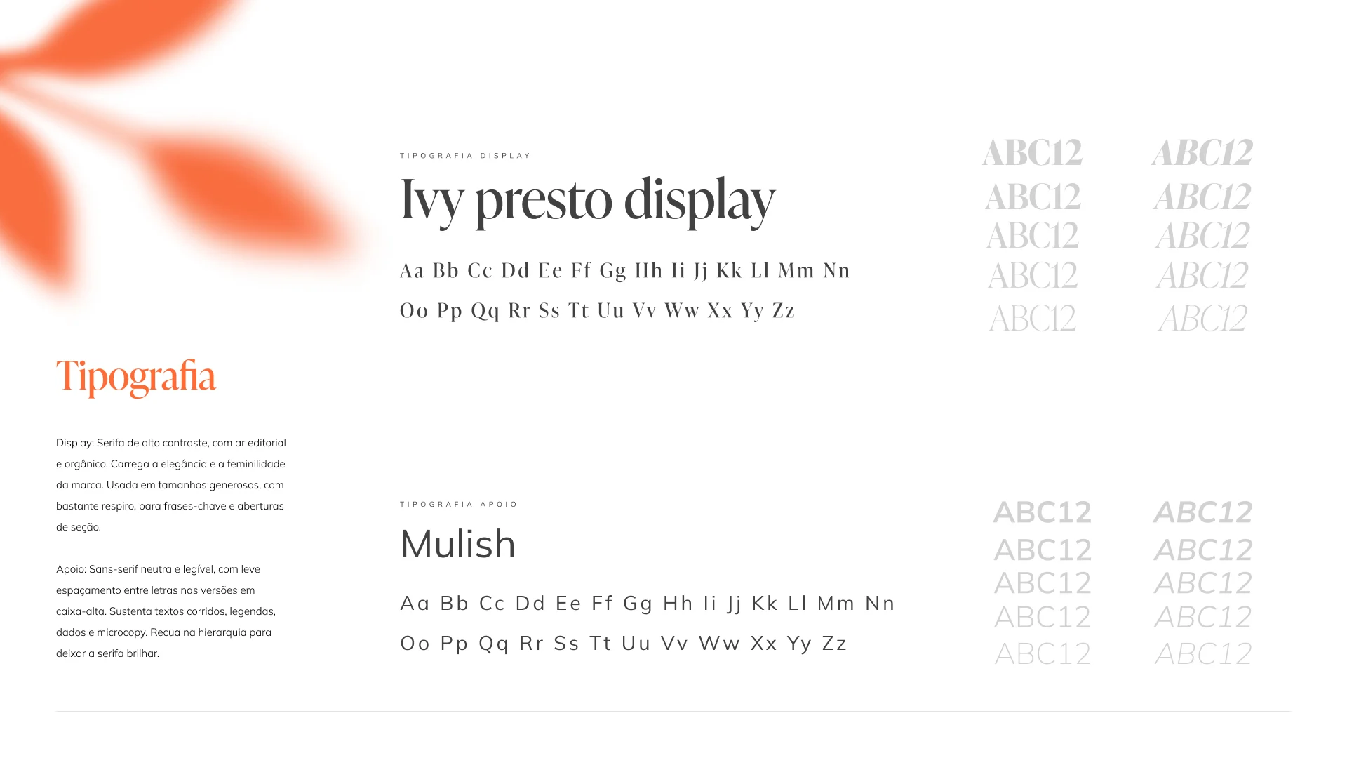
Coral (#F96D40) is the only vibrant colour in the system, and it earns that role precisely because it is used with discipline: for a word, a number, a key line, never to fill a whole surface. Around it, a family of warm neutrals, cream, sand and off-white, builds the editorial breathing room and the premium feel. On type, Ivy Presto Display carries the elegance in large, airy headlines, while Mulish steps back to keep body text and captions clean and legible.
Application
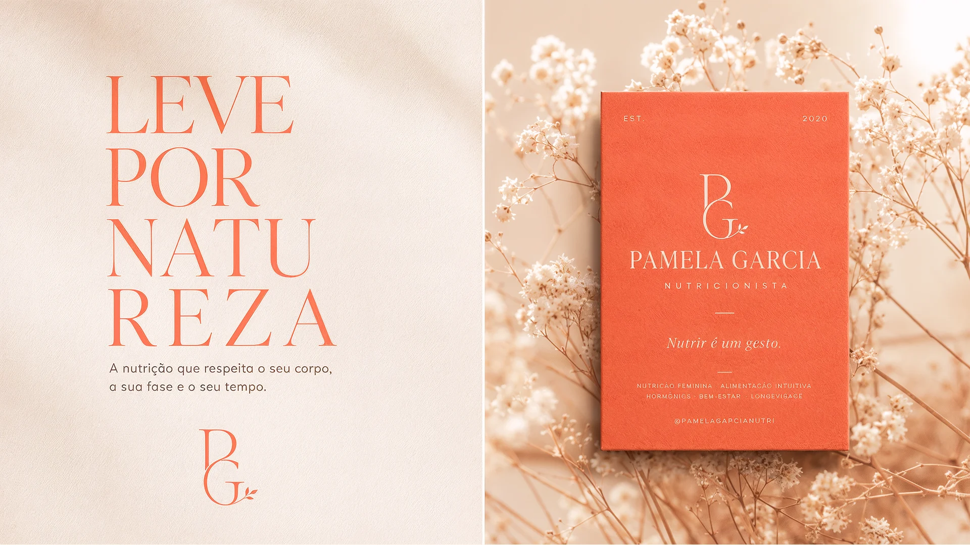
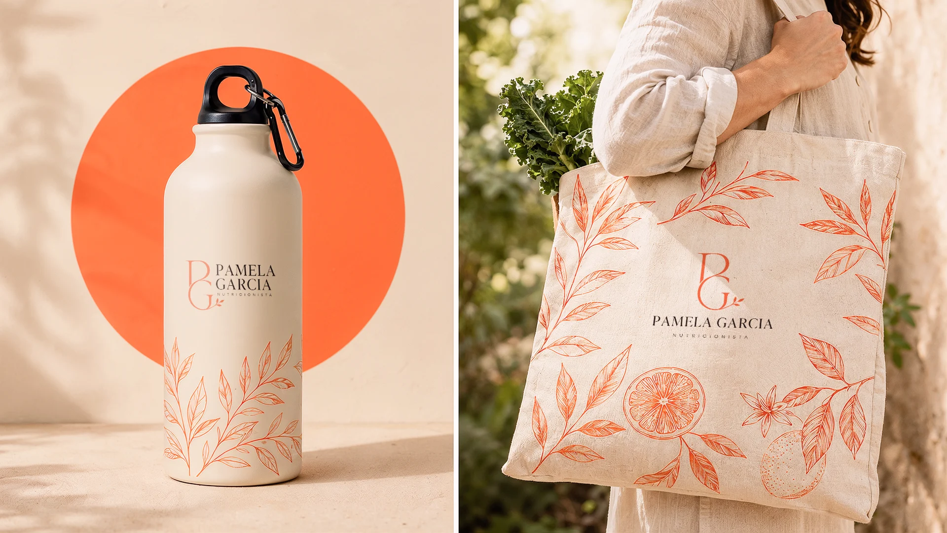
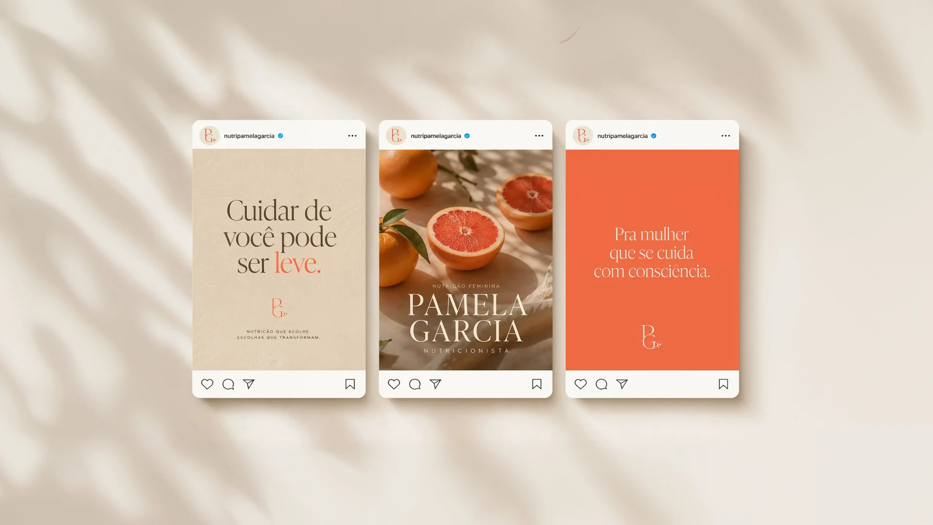
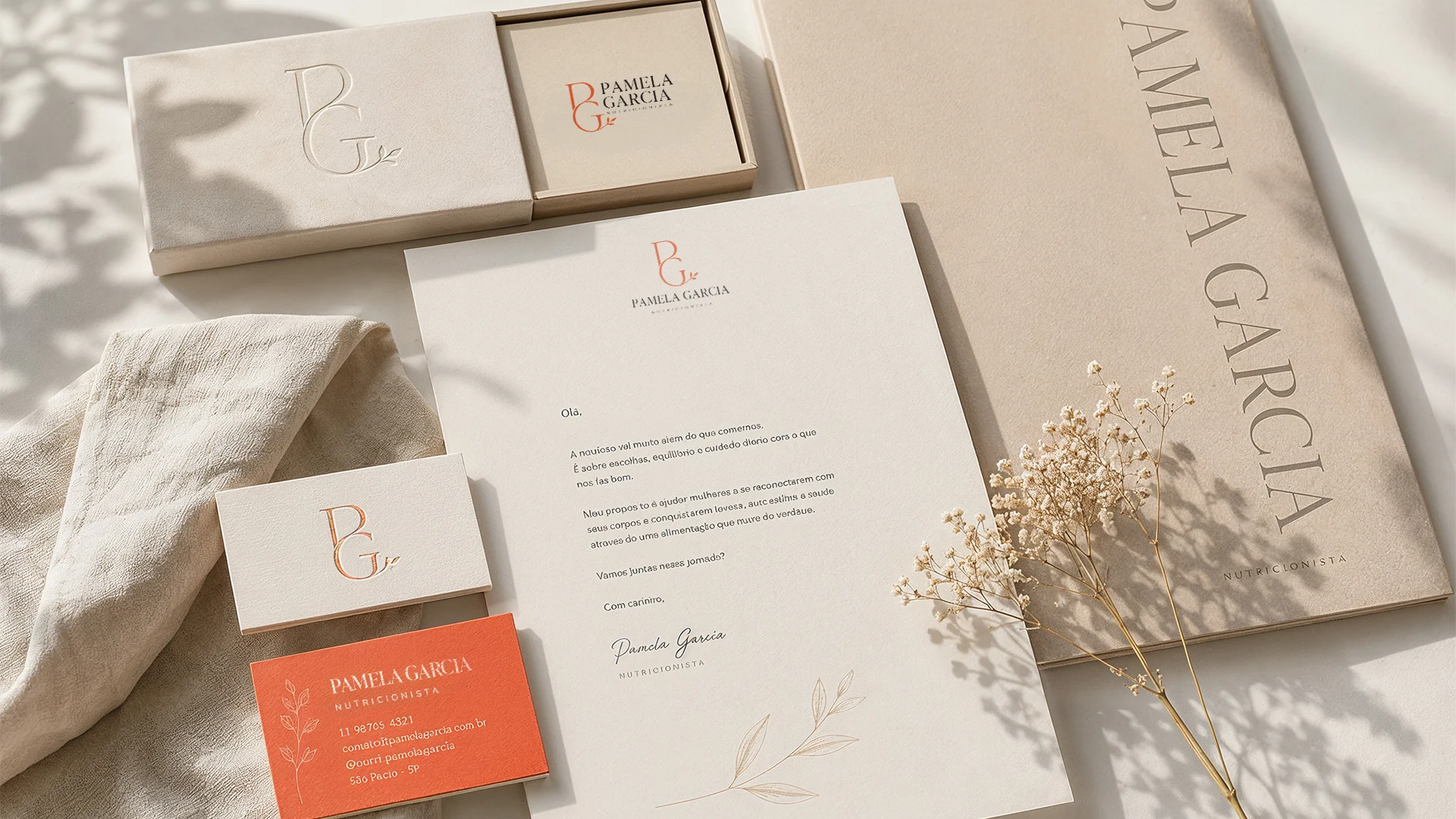
The system was built to live everywhere a personal brand shows up: stationery and packaging, a water bottle and a tote carrying a hand-made botanical illustration, a full set of Instagram templates, and the logo in coral, dark grey, off-white and sand so it holds on any background.
02Creative Process
Process & tools
I started from the concept, then built the full identity system in Figma: monogram, colour, type and the botanical language. From there, I produced the brand imagery with AI, generating and upscaling the visuals with Magnific and using Claude Code as part of the workflow, which let me create a consistent, premium look across packaging, social and web without relying on a photoshoot. Only then did I design the landing page that turns the brand into something that actually converts.
The landing page
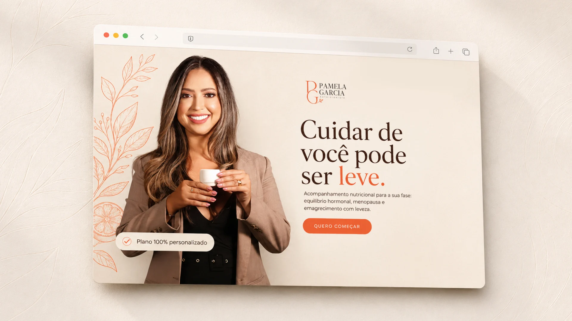
The site opens on one clear promise, “taking care of yourself can be light”, and carries the same warm system into a real product: personalised nutritional guidance for each stage of a woman's life. The whole flow, down to the thank-you screen, keeps the calm, editorial rhythm of the brand.
Outcome
The result is a nutrition brand that feels warm instead of clinical: one coherent system that carries the same lightness from a business card to a landing page, and gives Pamela a presence that matches the care she offers.